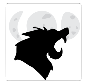
This is my first sketch and out of all three it’s one of my favorites. However I want to redo the werewolf because it’s a reincorporated image that I didn’t alter too much. I think a background color like a dark/gray-blue would look good. The moons need their sizes altered as well so they don’t look like separate images.
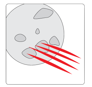
This one is kay. Not great but kay. I dislike the outline for the moon and the shapes but I do like the cut marks. Maybe they should be angled a little more and with more ridges. It also needs a background color other than white. I’m not sure this image does a good job communicating the purpose of the app.
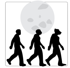
I like the concept of this one, it fits best with the purpose of the app. However there’s still a lot more that needs to be done with it. the human/werewolf shapes need their scale altered. I feel like they’re making the icon too bottom heavy. Background color needs to be added and I might try and use two human/werewolves instead of three. +background color!!!!


The use of illustrator is great and i have just some formally minded thoughts– I agree the three stages of transformation weighs down the design in third sketch, though more so it seems the use of black itself is a lot of weight on the design, what about a shade of blue to play off of the colors in your moon rendering? in the first and third sketch, what if the moon were centered behind the foreground figures–a stronger focal point, compact.
LikeLike